“Color is a shivering, glorious, active thing, a sympathy of poles founded on an exact kind of wavelength repulsion. Color is cagey, only partially knowable; it resists us even as it beckons. Thus the foundation of its perverse charm.” —Jude Stewart in ROY G. BIV: An Exceedingly Surprising Book about Color
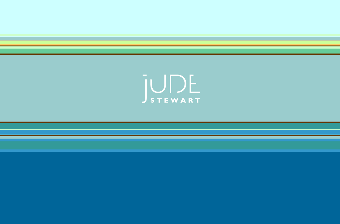
This is a business card and website I designed for Jude Stewart ages ago. At the time we worked together on this project, she was writing freelance for two main niches—finance and design. The look needed to be professional enough to appeal to business types, but creative enough to appeal to editors in the design field. Since Jude thinks in color (truly, she’s a synesthete) and writes about color (actually, she’s a color expert), the palette had to be fetching. 
I’ve held onto this design because even now the colors of the website are the colors I associate with Jude—a shock of fresh green, an open sky blue and a bit of grounding in brown.
With the publication of her wonderful book, ROY G. BIV—An Exceedingly Surprising Book about Color, her site was redesigned. But this first site was live for nearly a decade and enjoyed a remarkably long run in the web world.
You can find Jude’s witty articles about color at Print Magazine. She has also written on design and culture for Slate, Fast Company, The Believer, I.D., Metropolis.
And you should buy her book, ROY G. BIV. It’s a delightful romp through all the exigencies of color, filled with delicious quirky detail. You can thank me later.


Tuney: I still like this website design – it did a slightly tricky job so handsomely, and for so long! Plus updating it frequently gave us a primo excuse to talk frequently. Eager to read more of your thoughts on Hirst too.
Thanks, lady. It would’ve been something to have seen the Hirst retrospective together—loads to discuss.